Color has the power to shape how a space looks and feels, influencing everything from mood to perceived size. With so many options available, choosing the perfect paint tone can feel overwhelming—but understanding how color works in different spaces makes all the difference.
The Psychological Impact of Color
Color has a profound effect on emotions and behavior. Warm tones like reds, oranges, and yellows create a sense of energy, making them ideal for gathering spaces such as living and dining rooms. In contrast, cool colors like blues, greens, and purples promote relaxation, making them well-suited for bedrooms and bathrooms. Neutral shades, including whites, grays, and beiges, offer timeless versatility that allows furniture and décor to take center stage.
While personal style should guide color choices, considering how different shades influence mood and functionality can help create spaces that feel both aesthetically pleasing and practical for everyday living.
While personal style should guide color choices, considering how different shades influence mood and functionality can help create spaces that feel both aesthetically pleasing and practical for everyday living.
Choosing the Best Colors for Each Room
Living Room: Warm and Welcoming
As the central gathering space, a living room should feel comfortable and inviting. Warm neutrals like beige, greige, and light taupe provide a versatile foundation, while earthy shades such as terracotta or muted sage create depth and character. For a more dramatic look, deep blues or rich greens can add sophistication without overwhelming the space.
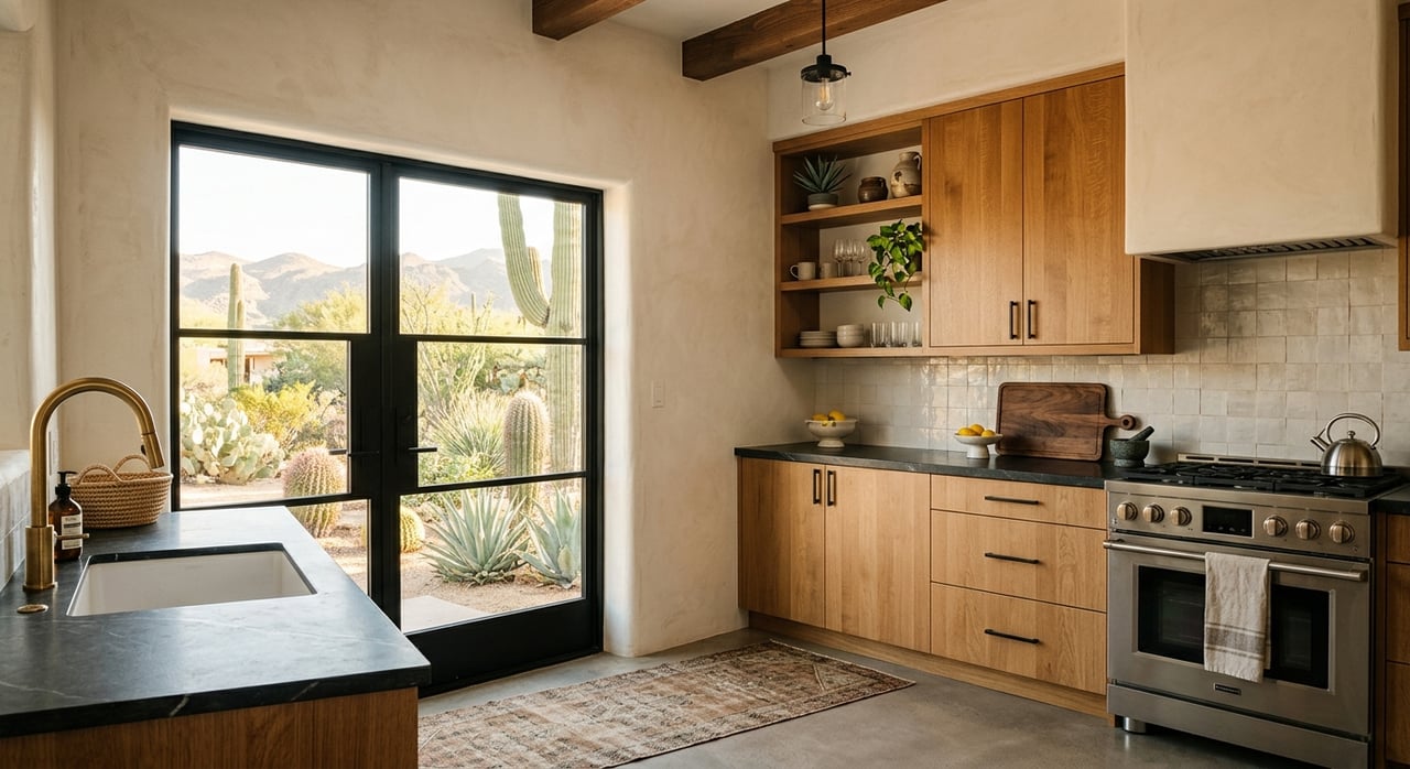
Kitchen: Fresh and Energizing
A kitchen benefits from colors that feel clean and lively. Soft yellows, muted greens, and airy blues bring a fresh, cheerful vibe, while crisp whites and light grays keep the space feeling modern and open. In homes with wood cabinetry or stone countertops, incorporating warm neutrals will help create a cohesive and natural look.
Bedroom: Calm and Restful
A bedroom should feel like a sanctuary, a place to unwind and recharge at the end of the day. Soft blues, lavenders, and gentle sage greens create a calming atmosphere, perfect for promoting rest and relaxation. Additionally, warm grays and ivory offer a soothing backdrop that pairs well with any décor.
Bathroom: Spa-Like Serenity
The right paint color can transform a bathroom into a relaxing retreat, evoking a sense of calm and cleanliness. Soft blues, seafoam greens, and pale grays bring a soothing, spa-like feel, while white and cream tones enhance natural light and make smaller spaces appear more open. For a more modern look, charcoal or slate gray paired with crisp white trim adds depth and contrast without making the space feel too heavy.
Home Office: Focused and Productive
The color of your home office can influence concentration, creativity, and productivity. Muted blues and greens create a calming environment that helps with focus, while soft grays and taupes provide a neutral, distraction-free setting. For a touch of sophistication, pops of navy or dark green can add depth and character without making the space feel too enclosed.
Dining Room: Cozy and Inviting
A dining room is a space for connection, conversation, and shared experiences. Warm, rich hues like deep reds, burnt oranges, and earthy browns create an inviting atmosphere that encourages engagement and togetherness. For more understated elegance, soft neutrals such as beige or greige provide a timeless backdrop that pairs well with a variety of décor styles. If a bolder, modern look is the goal, charcoal or patterned wallpaper can add just the right amount of flair.
The Role of Lighting
Lighting plays a crucial role in how a color appears. To ensure the perfect choice, it's important to test paint samples under different lighting conditions before making a final decision.
-
North-facing rooms receive cooler, indirect light, which can make colors appear darker. Warm tones help balance the space and prevent it from feeling too cool.
-
South-facing rooms get bright, warm light throughout the day, enhancing most colors. Light neutrals will appear extra bright, while darker shades will be more vibrant.
-
East-facing rooms have warm light in the morning but cooler tones in the afternoon. Soft, warm neutrals work well to maintain balance throughout the day.
-
West-facing rooms receive golden light in the afternoon, making warm tones feel richer, and cool colors take on a warmer cast.
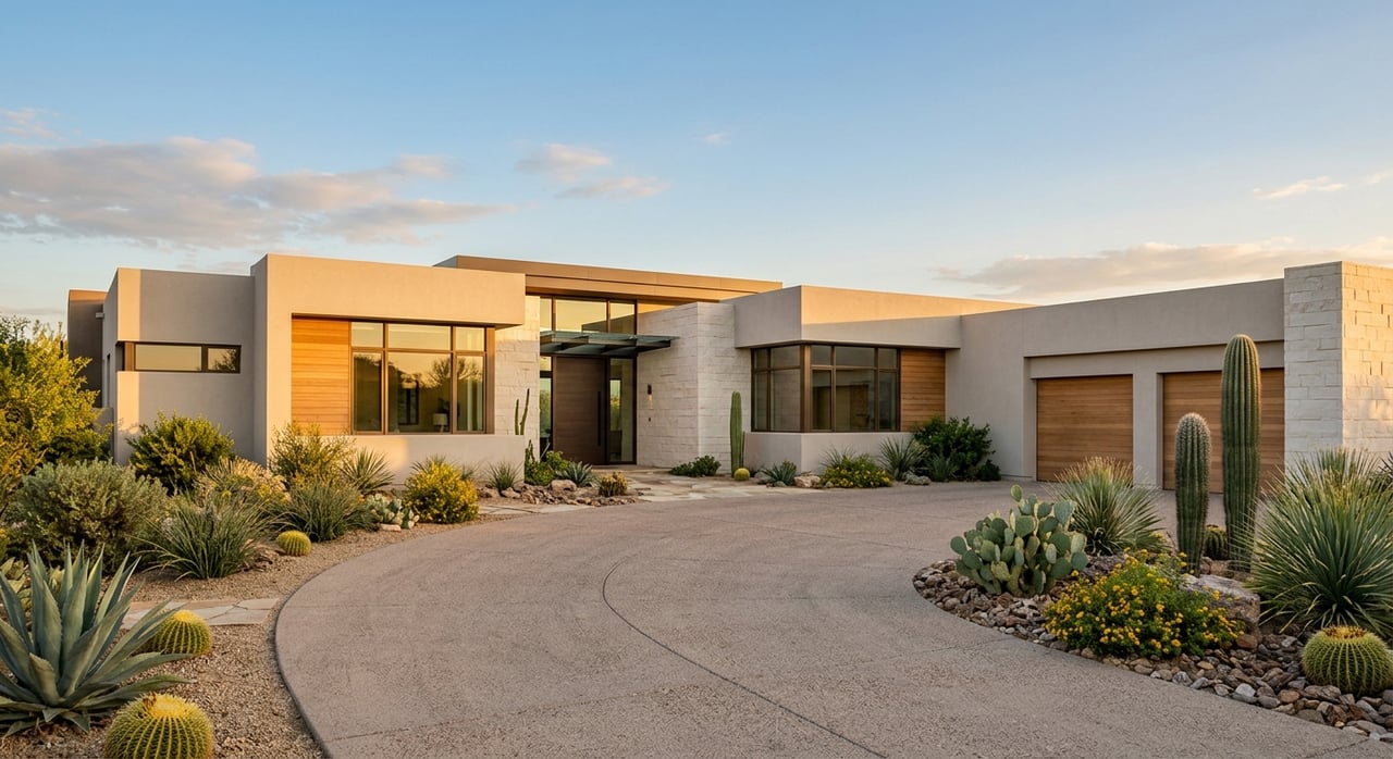
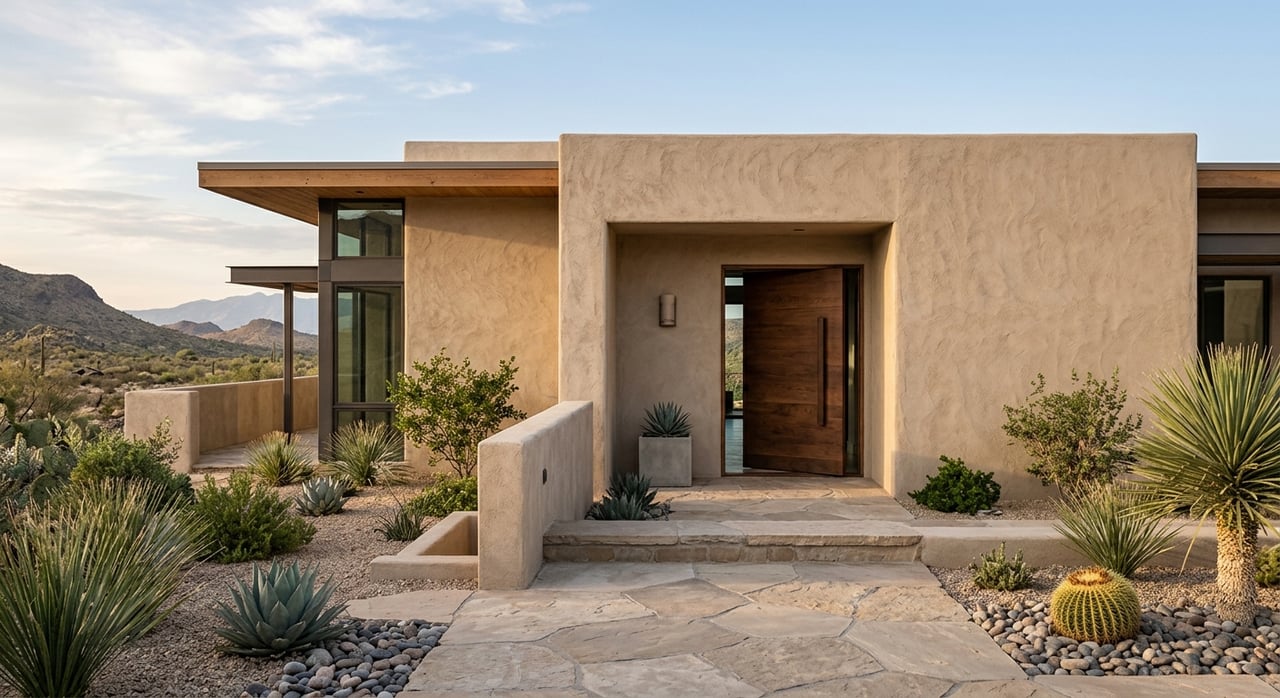
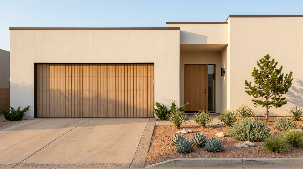
Popular Paint Colors in Albuquerque
In Albuquerque, paint choices often reflect the natural desert landscape. Homeowners frequently opt for warm, earthy tones that complement the region’s architecture and environment. Some of the most popular colors include:
-
Adobe-Inspired Shades – Soft terracotta, sandy beige, and clay tones that blend seamlessly with the Southwestern aesthetic.
-
Warm Neutrals – Taupe, warm grays, and creamy whites that create a timeless atmosphere.
-
Deep Greens and Blues – Inspired by the region’s natural elements, such as juniper trees and the Rio Grande.
-
Muted Pastels – Soft blues and greens that add a touch of color without overwhelming a space.
Tips for Choosing the Right Paint Color
Selecting the perfect paint color can be challenging, but following a few simple guidelines can make the process easier.
-
Start with Inspiration – Browse design magazines, visit model homes, or create a color board to gather ideas. Seeing colors in real spaces can help you visualize how different shades will look in your own home.
-
Consider the Room’s Purpose – Think about the mood you want to create and choose a color that supports that atmosphere. For example, soft blues and greens promote relaxation, while warm tones like red or yellow create energy and warmth.
-
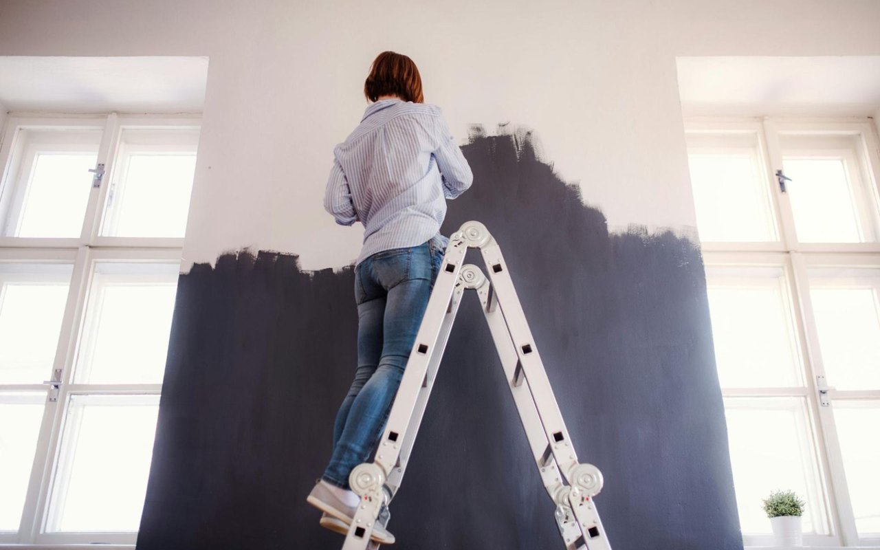
Test Paint Samples – Apply swatches to different walls and observe how the color changes throughout the day. Natural and artificial lighting can significantly alter a shade's appearance, so it's important to see it in different conditions.
-
Factor in Existing Décor – Consider how the paint color will work with flooring, furniture, and natural light. A well-chosen color should complement these elements rather than clash or compete with them.
-
Use the 60-30-10 Rule – A well-balanced color scheme includes 60% of the dominant color, 30% a secondary shade, and 10% an accent color. This approach helps create harmony and visual interest without overpowering the space.
-
Think Long-Term – Neutral shades provide flexibility and appeal to a wide range of styles. If you’re considering selling your home, neutrals create a clean, fresh look that helps potential buyers envision the space as their own. Choosing a timeless base color also allows for easy updates with changing trends.
Sell Your Home Faster with The Lovely Home Company
The right paint color can do more than refresh a space—it can enhance a home’s appeal and make it more attractive to buyers. If you're preparing to sell, The Lovely Home Company can provide expert guidance on color choices and other updates to help your home stand out. Contact The Lovely Home Company today to get your home market-ready and attract the right buyers.